
Scope
Full site, 4 pages
Timeline
Solo, iterative
Device
Mobile → Desktop
Role
Designer + Builder
A self-directed project to design and build a fashion e-commerce experience that feels like a real luxury house, not a template, from the first scroll on the homepage through to checkout, on a phone or a 27-inch monitor.
The brief I set myself.
There was no client for this one, I gave myself the brief on purpose, because the best way to prove you can design for luxury fashion is to actually design something a luxury fashion house could put their name on.
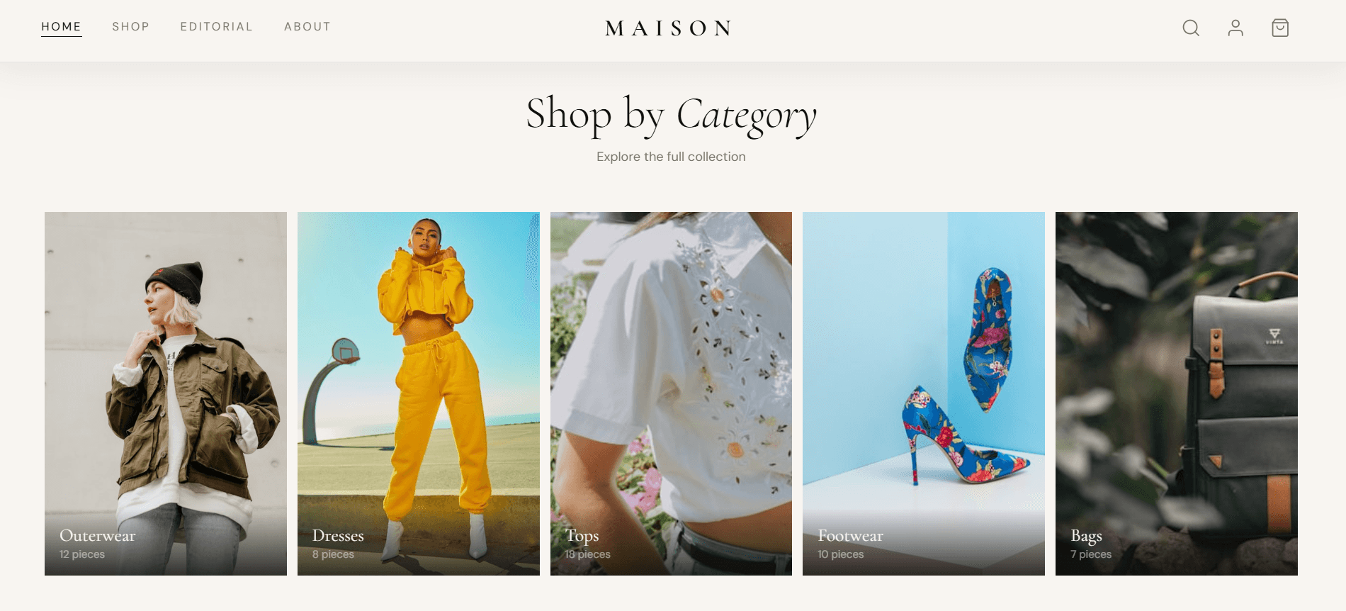
The constraint I picked: build a complete shopping experience, homepage, full catalog, product detail, and checkout,that holds up against the actual sites these brands ship, not a simplified student version of one. Real product photography, a real cart that updates as you shop, real filtering, a real order flow.
And it had to work properly on a phone first, because that's how most people actually shop, not as an afterthought squeezed in once the desktop version was "done."
My Role
Visual design, copywriting, and the full frontend build, every screen, every state.
Brand Direction
Quiet luxury, ink black, parchment, and a single warm gold accent. No loud colour, no stock-template feel.
Core Challenge
Make the catalog and cart feel as considered as the homepage hero, all the way to checkout.
Devices Tested
A 375px phone screen up to a 1440px+ desktop monitor, with everything in between.
Walkthroiugh . 01
A homepage that sells the mood before it sells a single product.
Decision
The hero rotates between two model shots, each paired with a different featured piece in a floating product card on the right, so the page is never showing just one outfit. It's doing the job a print campaign spread does: set a mood, then let the product card be the quiet call-to-action sitting inside it.
The line "Dress Intentionally / Live Beautifully / Wear Forever" sits above everything else, in a thin bar that's there on every device. It's a small detail, but it's the first thing a visitor reads, and it tells them what kind of brand this is before they've scrolled an inch.
Why it matters: most fashion homepages either show one static banner image, or cram five product callouts above the fold. This gives the visitor one clear feeling and one clear next step "Shop the Collection" without competing for attention.

Walkthroiugh . 02

A catalog that stays calm even when it's showing everything.
Decision
The shop page uses a simple filter bar. All, Tops, Bottoms, Dresses, Outerwear, and so on, instead of a dense sidebar full of checkboxes. On mobile this scrolls horizontally as a single row of pills; on desktop it sits alongside a fuller filter panel for size, colour, and price.
Every product card shows a clean image, the name, the fabric, and the price up front. Hovering a card on desktop swaps in a second photo and reveals a "Quick Add" bar so a shopper who already knows their size never has to open the product page at all.
Why it matters: the grid scales from 2 columns on a phone to 4 columns on a wide screen using the same markup, no separate "mobile version" of the page was built. What changes is column count and spacing, not the underlying structure, which is what keeps the page feeling consistent at every size.
Walkthroiugh . 03
Enough detail to justify the price, without slowing anyone down.
Decision
Each product page leads with the fabric and construction detail, "Italian merino wool," "22-momme silk charmeuse" because that specificity is what a shopper paying a premium price is actually looking to be reassured by. Generic descriptions don't earn trust; precise ones do.
Colour and size selection are large, tappable blocks rather than a tiny dropdown, sized for a thumb on a phone screen as much as a mouse pointer on a desktop. The "Add to Bag" button always reflects the size currently selected, so there's never a moment of doubt about what's about to happen when you tap it.
Why it matters: a product page's only job is to remove hesitation. Every choice here the fabric copy, the size buttons, the shipping reassurance line near the bottom is there to answer a question before the shopper has to ask it.

Walkthroiugh . 04

A cart you can check without losing your place in the catalog.
Decision
The cart opens as a slide-out panel over the current page rather than a separate cart page so a shopper can glance at their bag, adjust a quantity, and keep browsing without losing where they were. The bag icon in the top corner carries a small gold counter that pops gently every time something is added, a tiny piece of feedback that confirms the action without needing a popup or a banner.
Subtotal, shipping, and the path to checkout are always visible at the bottom of that panel, so the total cost is never a surprise saved for the very last screen.
One more thing
See the catalog reflow, live.
Drag the slider this is the real grid behaviour from the shop page above, scaling from a phone's 2-column feed up to a 4-column desktop layout, without a separate "mobile design" underneath it.
375px
1280px
1074px · desktop
At 1074px: full 4-column catalog — same page, same code.
Not a mockup. A working store you could actually shop.
4
Complete page types, fully wired
Homepage, shop catalog, product detail, and checkout all connect to a real shared cart adding an item on the homepage shows up correctly at checkout, every time.
375–1440px
Tested across the full device range
Every page was checked at phone, tablet, and desktop widths and at the awkward sizes in between, not just the three "standard" breakpoints.
1
Consistent visual language, start to finish
The same five-colour palette and two typefaces carry through every screen homepage, catalog, product page, and checkout feel like one brand, not four separate templates.
Available for Work
If your brand needs this
level of care, let's talk.
I design and build complete e-commerce and product experiences from the first sketch to a working site a customer can actually buy from. If you're a founder, a creative director, or an agency that needs that combination, I'd like to hear about what you're building.
View My Portfolio →
Get in Touch