Sundryagro A User Centered Groceries Webapp Design
Grocery shopping should be simple, not stressful, making it easy for users to find fresh produce, compare prices, and check out effortlessly.
Project Type: End to end webapp
Role: Sole Product Designer with support from product manager and developers
Industry: E-Commerce
Tool: Figma, Figjam, Google Meet, Pluggins
Duration: 3 Weeks
Section
Introduction

"How can I restock my groceries quickly, i don't have any thing at home again?"
35 Year old busy adult

Sundryagro is an online shopping base platform where users can order for the groceries products
-Sundryagro has personal shoppers that help buyers get their products within selected state where the e-commerce company operate in Nigeria
-Sundryagro has been running their products on no-code website that has been customized already, but has the company grows the founder demands a proper built in website and mobile app for the company
Users

Adults between 24-65, who are busy and finds it difficult to go to the market to buy things
The Product

Sundryagro is an online store designed to make grocery shopping seamless, efficient, and stress-free. This web app prioritizes intuitive navigation, smart recommendations, and a frictionless checkout.
Business Goal

We want to make shopping seamless for users who prefers website
Research Insight

How I make Sundryagro Webapp seamless for users

Problem
During our user research, we discovered that a major pain point for shoppers is the complexity of navigating e-commerce platforms. Through surveys, usability tests, and user interviews, we identified key frustrations and expectations

Proposed Solution
Finding products quickly and checking out with one click was a top priority for users. Many struggled with cluttered menus and unclear categories.
How I Achieved This
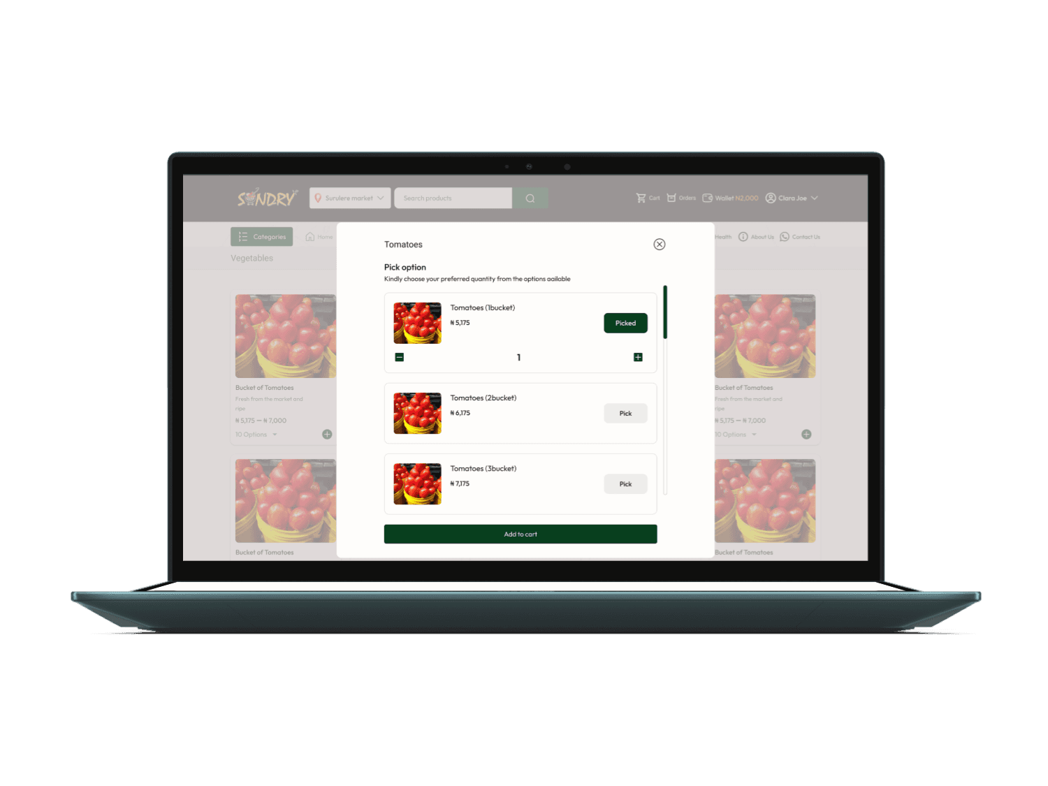
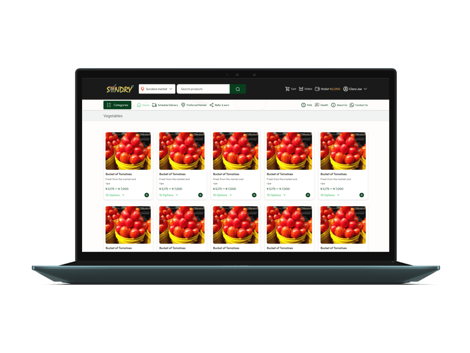
1. Introduce a clear category structure with predictive search suggestions.
2. Add options to easily show varieties of a product
3. Use a sticky top bar for quick access to key sections
4. Offer one-click checkout and option for guest to view trendy goods
5. Enable auto-fill for address and payment details to reduce friction
6. Implement a mobile friendly layout for responsiveness


What Works

1. Intuitive Navigation & Search
- Smart search bar with auto-suggestions and filters
- Easy-to-browse categories (e.g., fruits, dairy, snacks)
- Quick access to favorites & past purchases
2. Seamless Shopping & Checkout
- One-click add to cart with quantity adjustment
- Simple, fast checkout process with multiple payment options
- Personal shopper handling delivery
3. Mobile-Friendly Design
- Friendly buttons for easy tapping
- Optimized for one-hand use (important for mobile shoppers)
- Fast-loading pages with minimal clutter
4. Personalized User Experience
- Recommend items and price based on preffered market location
- Deals & discounts i.e referral policy
- Fast-loading pages with minimal clutter
5. Accessibility & Inclusivity
- High contrast text & images for readability
What Didn't Work

1. Personalization
❌ We intend to allow users to schedule delivery but this didn't work in this phase, we shifted it to secod phase. We need to study our users to see how seamless the check out is for now
Priority
Since users prioritize finding products quickly, I focused on the solution ideas to make finding products and checking out seamless
What I Learned

Understanding User Needs
Users prioritize speed and convenience—they want to find items quickly and check out with minimal effort. Also, Many users prefer a familiar shopping experience (e.g., categorized navigation, search filters, and easy reordering).
Next Project
End to end sundryagro's mobile app
Thank you for your interest in my work
I designed and built this portfolio in Framer, to reflect my unique vision
© 2025 Olufolake Olufade Framer. All Rights Reserved.

Back to top