
Smart Money Management for All Ages

Ouomo Fintech
Research shows that Traditional fintech apps tend to focus either on adults or kids, rarely providing an integrated experience for both. Ouomo was designed to solve this gap.
Project Type: end to end cross-platform design
Role: Product Designer & Prototyping Specialist (Led end-to-end product design, from research to UI/UX, development and execution.)
Industry: Fintech
Tool: Framer, Miro, Figma, Pluggins
Duration: 2 Weeks


Here Are The Links To The Product Prototypes
Each link will lead you to the full responsive design where you can interreact and see how each design works.
View Landing Page In Framer
View Adult Fintech In Framer
View Kid Gamified Fintech In Framer
Project Overview

Overview & Problem Statement
Ouomo Fintech is a self-initiated fintech web app designed to help both kids and adults manage their finances. The goal was to create a user-friendly, engaging, and educational platform where kids learn about money through gamification, while adults get intuitive financial tools for savings and budgeting.
Users

Adults between 18-70

Kids between 4-17
Problem Statement
Traditional fintech apps tend to focus either on adults or kids, rarely providing an integrated experience for both. Ouomo was designed to solve this gap by providing:

Adults – A streamlined savings and budgeting tool.

Kids – An engaging, gamified financial learning experience.

Parents – A way to supervise and manage their kids’ financial activities.
Goals
Traditional fintech apps tend to focus either on adults or kids, rarely providing an integrated experience for both. Ouomo was designed to solve this gap by providing:
🔹 For Adults: Provide a clean, intuitive, and goal-oriented savings platform.
🔹 For Kids: Simplify financial concepts using gamification and interactive challenges
🔹 For Parents: Enable easy tracking and control of kids' financial engagement.
Core Features & Achievements
Traditional fintech apps tend to focus either on adults or kids, rarely providing an integrated experience for both. Ouomo was designed to solve this gap by providing:
🔹 Dual Experience – One platform catering to both kids and adults. 🔹 Savings Plans – Easy-to-use 3, 6, or 12-month savings goals.
🔹 Gamified Learning/ Refer & Policy Fun quizzes, rewards, and interactive challenges for kids. For Adults Encourages engagement through referrals.
🔹 For Parents: Enable easy tracking and control of kids' financial engagement.
Competitive Analysis

Insights from Analysis
- GoHenry & Greenlight: Gamified kid banking but limited adult experience.
- Mint & YNAB: Strong for adults but lack features for younger users.
- Revolut & Monzo: Flexible financial tools but lack educational elements.
Key Takeaways:
✅ Opportunity to unify the experience for both kids and adults.
✅ Need for a simple yet engaging UX to cater to diverse users
✅ Gamification elements can drive engagement and learning for younger users.
Design Process
User Flow
With the competitive analysis in mind, I began the wireframing process to map out the user journey. I mapped out seamless transitions between educational elements for kids and financial tools for adults.

Low Fidelity Wireframe
To translate our research insights into a structured user experience, I began with low-fidelity wireframes. These simple, skeletal layouts helped us quickly visualize the platform’s structure, ensuring a logical and intuitive user journey from landing page to performing various financial activities.


High Fidelity Wireframes
After refining the low-fidelity wireframes and validating the core user flows, I moved into the high-fidelity design phase. This stage focused on translating the wireframes into polished, visually engaging interfaces while maintaining clarity and usability.
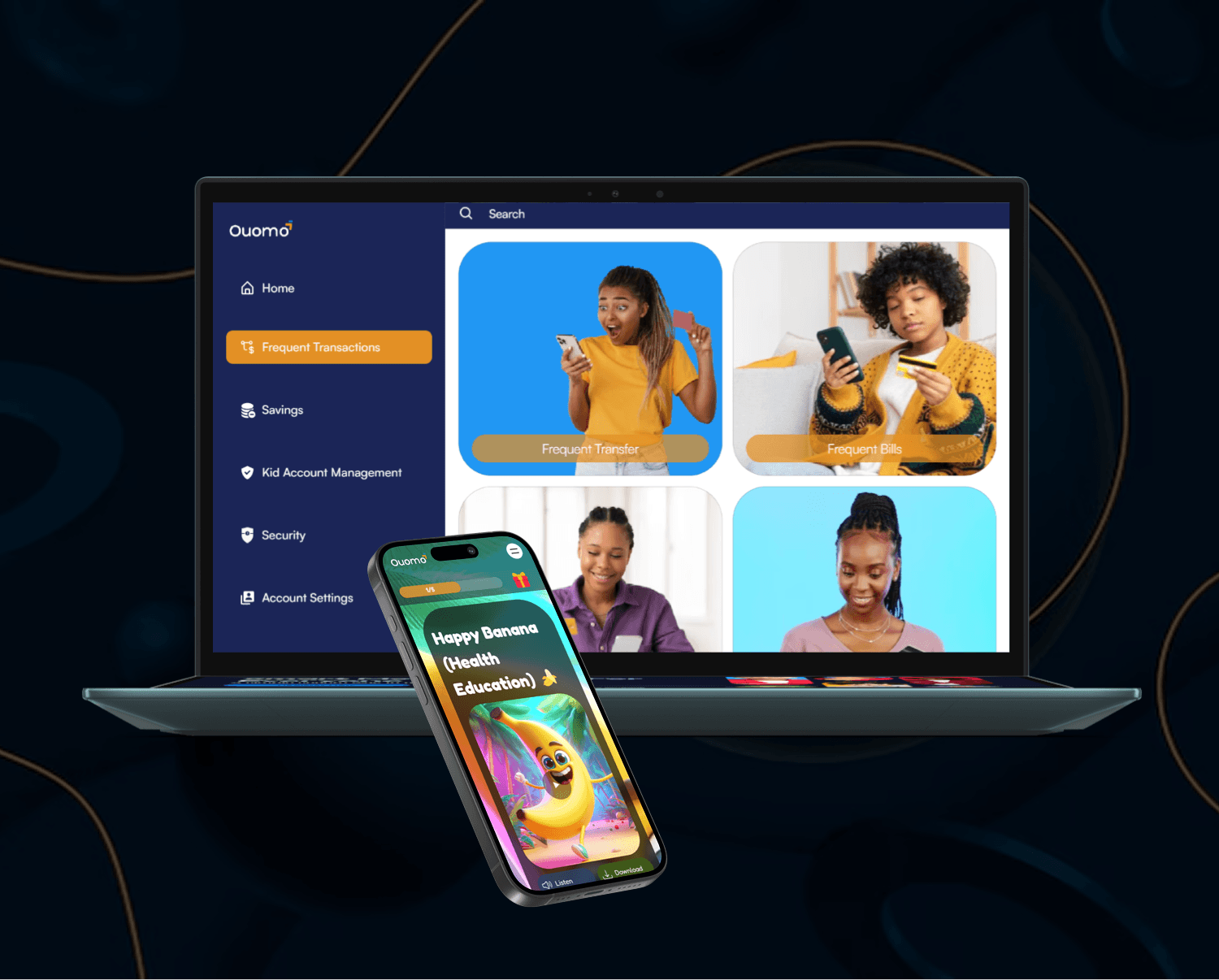
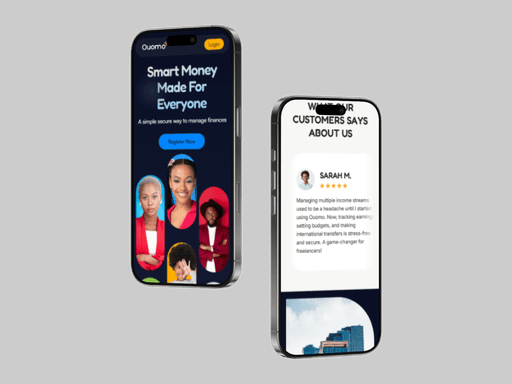
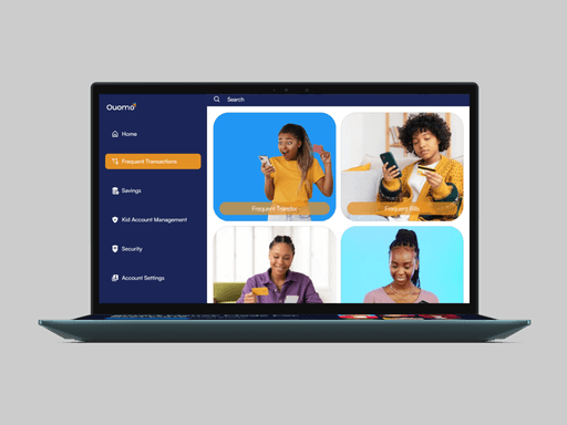
Landing Page Design
The landing page serves as the gateway to the Ouomo Fintech experience, clearly segmenting the offerings for kids and adults while maintaining a unified brand presence.


Kid Interface Design
Bright colors, fun illustrations, and interactive animations to make learning enjoyable. 🏆 Gamification: Challenges, streaks, and rewards to encourage financial habits. 📖 Storytelling elements: Quizzes and interactive lessons to reinforce learning.


Adult Interface Design
Minimalistic dashboard for easy financial tracking. 📅 Custom savings plans (3, 6, or 12 months) to support financial goals. 🔄 Quick deposit & withdrawal options for flexibility.


Key Achievements
1. Developed a visually distinct but cohesive UI for both kids and adults.
2. Simplified complex financial tasks into one-click actions for ease of use
3. Crafted an engaging experience without overwhelming the user.
Interactive Prototype
With the high-fidelity designs finalized, I moved into the interactive prototyping phase to bring the user experience to life. This step allowed meto simulate real interactions, ensuring the platform felt intuitive and usable.
Challenges & Solutions

Challenges
1. Balancing a playful design for kids with a professional UI for adults
2. Making financial education engaging for younger users.
3. Ensuring smooth navigation for both age groups.
Solutions
1. Used distinct color palettes and UI components while maintaining brand consistency.
2. Integrated gamified elements like badges, streaks, and animated rewards.
3. Designed a clear, intuitive onboarding that asks users if they’re a kid or adult right at the start.

Future Enhancements
Expand the learning modules for kids with more interactive stories. Introduce AI-driven personalized financial tips for adults. Also, develop multi-user family accounts to create a shared finance experience.
Final Thoughts

Note
This project showcases my ability to design a fintech app that serves multiple demographics while maintaining usability and engagement. By integrating gamification, savings tools, and parental controls, I was able to create a balanced, intuitive experience that demonstrates strong UX principles.
✅ Achievement-Driven, Portfolio-Worthy, and Designed for Real-World Applicability.
Thank you for your interest in my work
I designed and built this portfolio in Framer, to reflect my unique vision
© 2025 Olufolake Olufade Framer. All Rights Reserved.
Back to top